The Specific Heats
Website, Bio.site, social media, motion graphics, promotional merchandise, digital singles, and full album artwork and design.
For the new website for The Specific Heats, I took the background pattern from a previous release where it was originally purple. I shifted the color to orange to allude to the color palette of the upcoming release and the current color scheme of the website.
Similarly, the background paisley patterns of the two digital singles leading up to the new EP are lower-fidelity snippets of the full pattern used on the EP.
If you’re unfamiliar with 1960s garage and psych-pop bands, you’re probably wondering: “Why the “Y” in Decaydes?” The answer is three-fold: First: as a nod 1960s vernacular; Second: the tongue-in-cheek implication of “decay” over the group’s absence (both of the members of the group themselves as well as our society as a whole); and lastly: the very Massachusetts pronunciation JFK uttered in his “We choose to go to the moon…” speech. The group began in Boston in 2004 and though only are 2/3 Massachusetts natives, all have called Boston their home at some point.
Social media promo advertising the first single.
“Lemons Never Forget” Marbled Vinyl
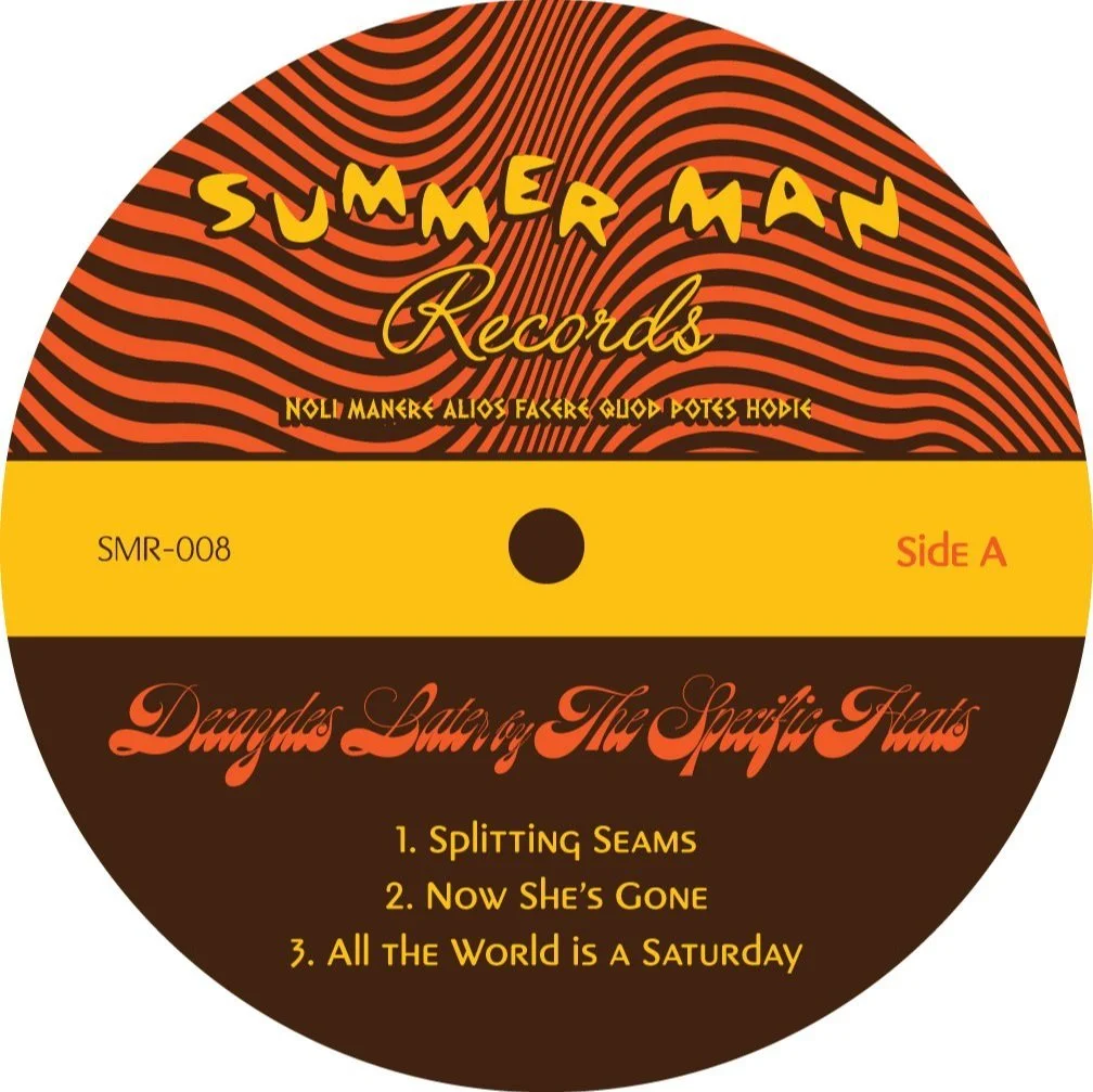
Record label - Side A
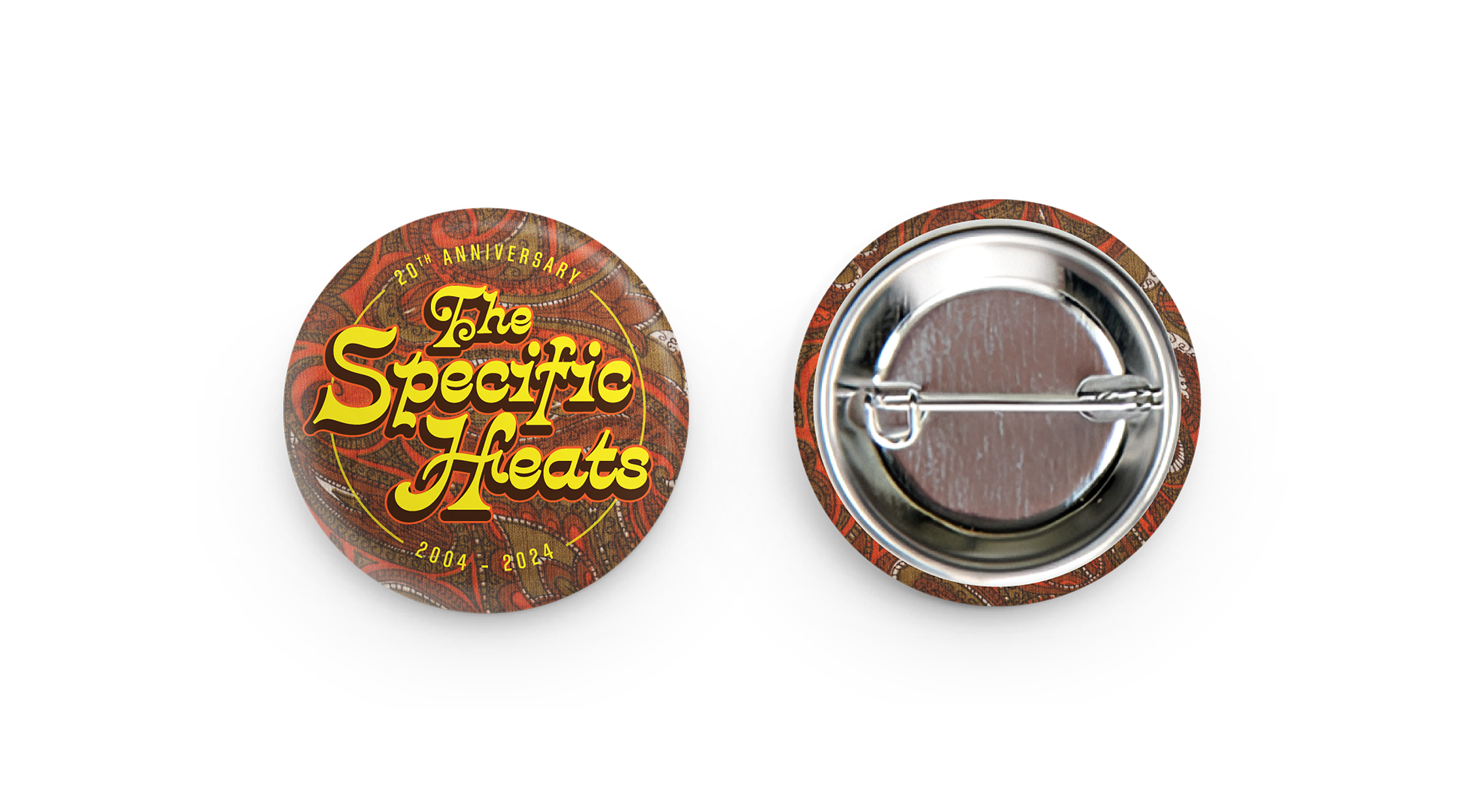
Promotional 1.25” 20th Anniversary Pinback Button/Badge to accompany all direct orders and pre-orders of the vinyl edition.
Canvas for Spotify - an 8-second animation that plays when a user is listening to the song.
Mock-up of orange vinyl edition
Record label - Side B
3” matte vinyl sticker to accompany all direct orders of the vinyl edition


